
The Data tab of a project is where you browse its resources class by class. Show them as a list next to a resource viewer, or as a table with one row per resource and one column per property. From there you can open, compare, edit, annotate, link, and download your data.
Browse Data in the Data Tab
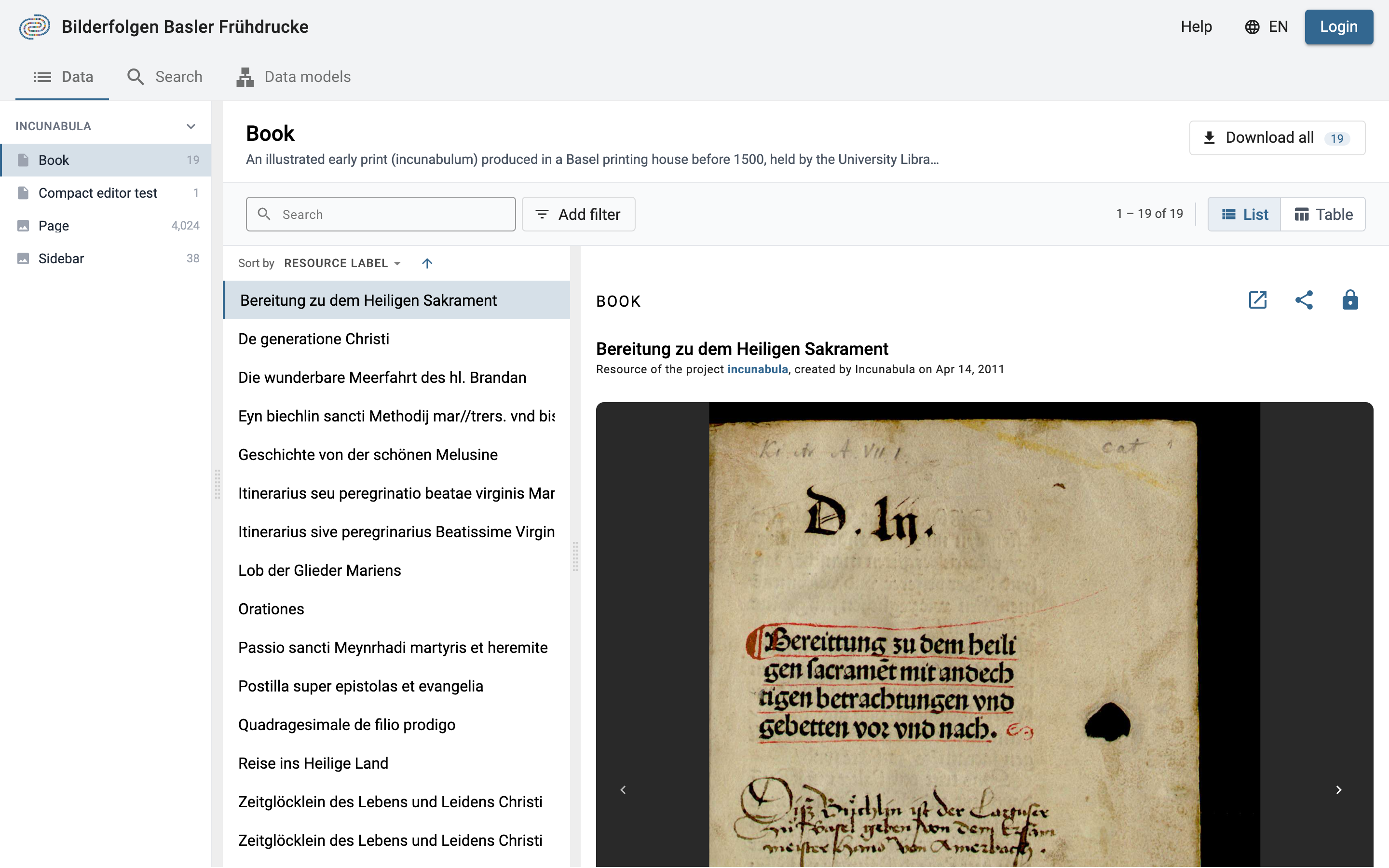
The Data tab in list view.
Choose a Resource Class
The left sidebar lists the project's data models. Under each data model are its resource classes, sorted alphabetically, each with an icon for its file type and the number of resources it holds. Click a data model name to open or close its group, and click a class to show its resources.
You can drag the edge of the sidebar to make it wider or narrower. With no class selected, the Data tab shows the project description.
The Class Header
The header shows the class name and description, along with:
- Download all — export every resource of the class as a CSV file (see Download Data). The badge shows how many resources the class has.
- Create a resource — add a new resource of this class (project members only, see Create New Resource Instances).
- Search — a full-text search within this class. It uses the same rules as the full-text search and shows a hint below the box if a term is incomplete (e.g. fewer than 3 characters, or an unclosed quotation mark).
- Add filter — narrow down the resources with conditions on their properties (see Filter Resources).
- Reset — clear the search, the filters, and the sorting. It appears once one of them is set.
- Result count and pages — e.g.
1 – 25 of 120. Results are shown 25 per page; use the arrows or type a page number and press Enter to jump to it. - List / Table — switch between the two views.
The search, the filters, the sorting, and the chosen view are kept in the page URL, so you can bookmark or share exactly what you see. Selecting another class clears the search, filters, and sorting, but keeps the chosen view.
Filter Resources
Filters narrow down the resources of the class to those whose properties match a condition. They work the same way in the list view and in the table view: the filters stay active when you switch between the two.
To add a filter:
- Click Add filter.
- Choose a property of the class, e.g. Title.
- Choose an operator, e.g. is like. The operators available depend on the type of the property (see Comparison Operators).
- Enter or select a value, then click Add or press Enter.

Adding a filter: property, operator, and value.
The filter appears as a chip next to the search box (e.g. Title is like "Christi") and the results update right away, together with the result count. Click a chip to edit its condition, or the ✕ on the chip to remove it. Click Reset to remove all filters, the search term, and the sorting at once.
You can combine several filters and a search term: only resources that match all of them are shown. On a link property, the matches operator lets you add sub-criteria on the linked resource, as in the advanced search.
In the table view, you can also filter from a column: hover over the column header and click the filter icon to add a filter on that property, or to edit it if one exists. A highlighted filter icon shows which columns are filtered.
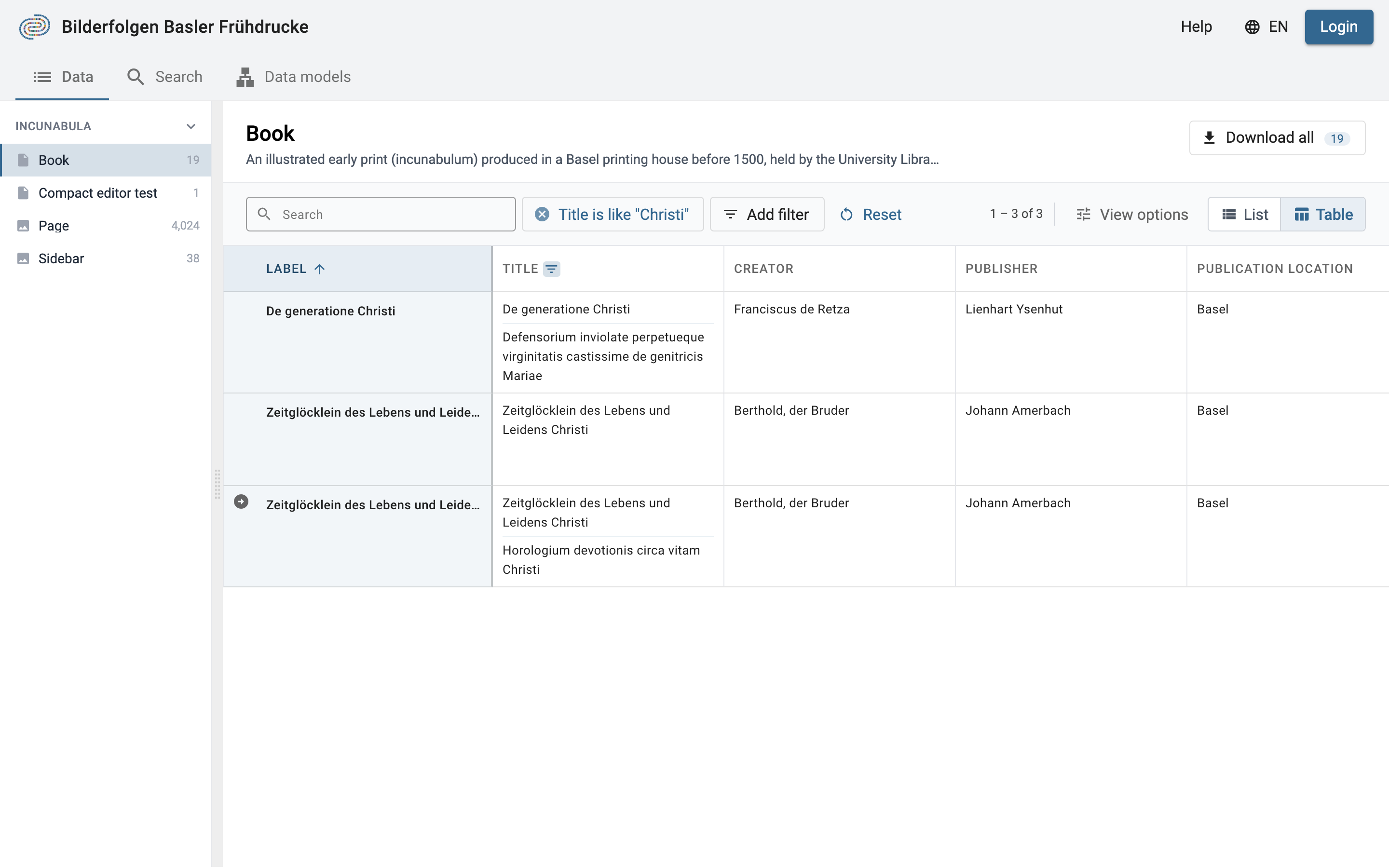
A filter on the Title column, in the table view.
If no resource matches, the Data tab says so. Remove or change a filter to see results again.
List View
The list view is the default. The resources of the class are listed on the left and the selected resource is displayed on the right. The first resource is selected automatically.
Use Sort by above the list to choose the property to sort by, and the arrow next to it to switch between ascending and descending order. By default, resources are sorted by their label. Link and list properties cannot be used for sorting.
Table View
Click Table to display the resources as a table: one row per resource, one column per property. This is useful for comparing values across many resources at once.
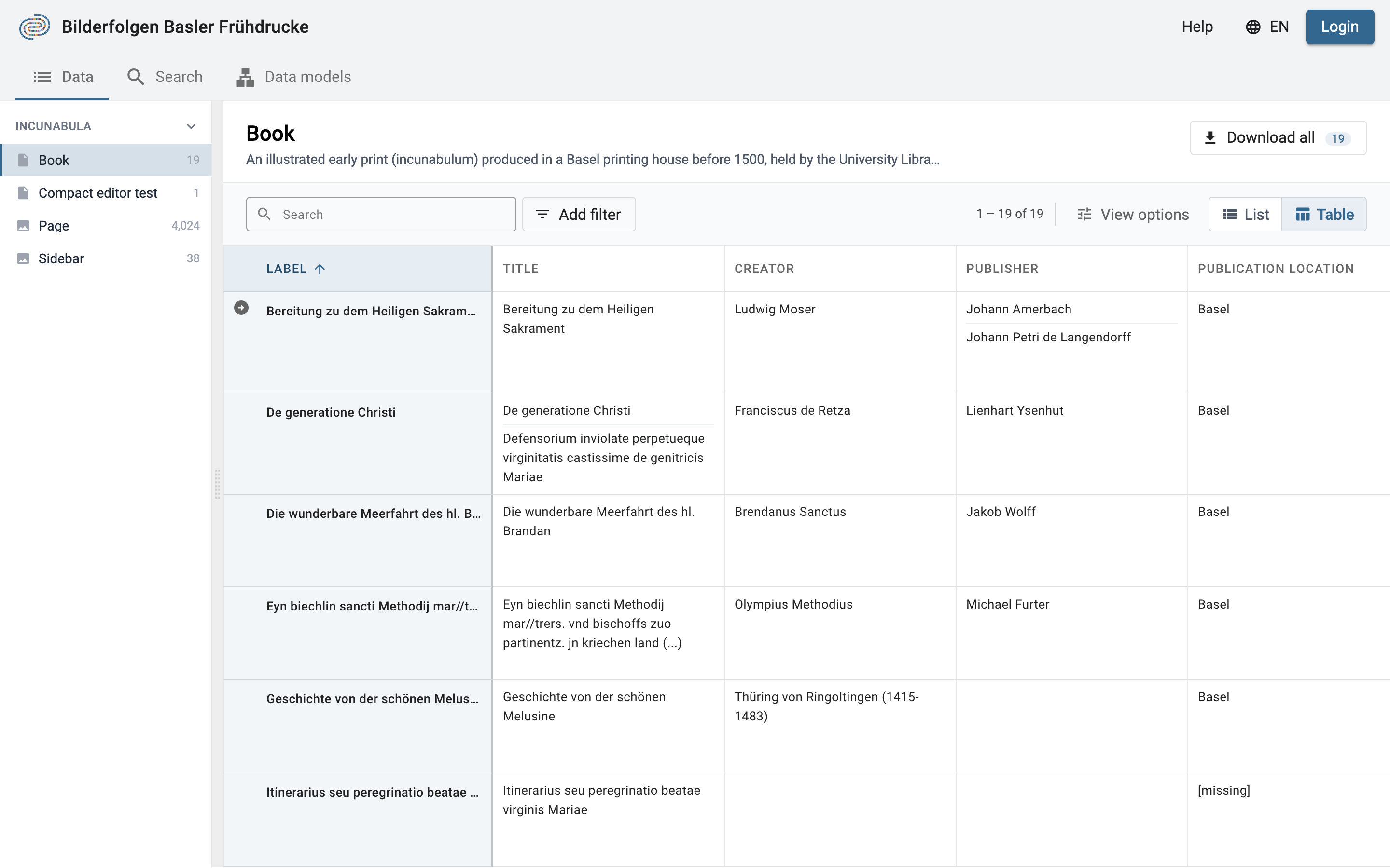
The table view: the label column stays on the left while you scroll through the properties.
The columns are, in order:
- Label — always shown, and always fixed on the left.
- Image — a thumbnail, only for still-image classes. Hover over or click it to see a larger preview.
- One column per property of the class, in the order defined in the data model.
- License, Copyright holder, and Authorship — the legal metadata of each resource.
Values look the same as in the resource viewer: links, list values, dates, and formatted text are all displayed as usual. When a cell has more than 3 values that cannot be edited in the table, the remaining ones are hidden behind Show more.
Sort, Filter, and Pin Columns
Hover over a column header to show its controls:
- Sort — sort the table by this column. Click again to switch between ascending and descending order. The table and the list share the same sorting.
- Filter — add a filter on this property, or edit the existing one (see Filter Resources).
- Pin — keep the column fixed next to the label column while you scroll horizontally. Click Unpin to put it back in its place.
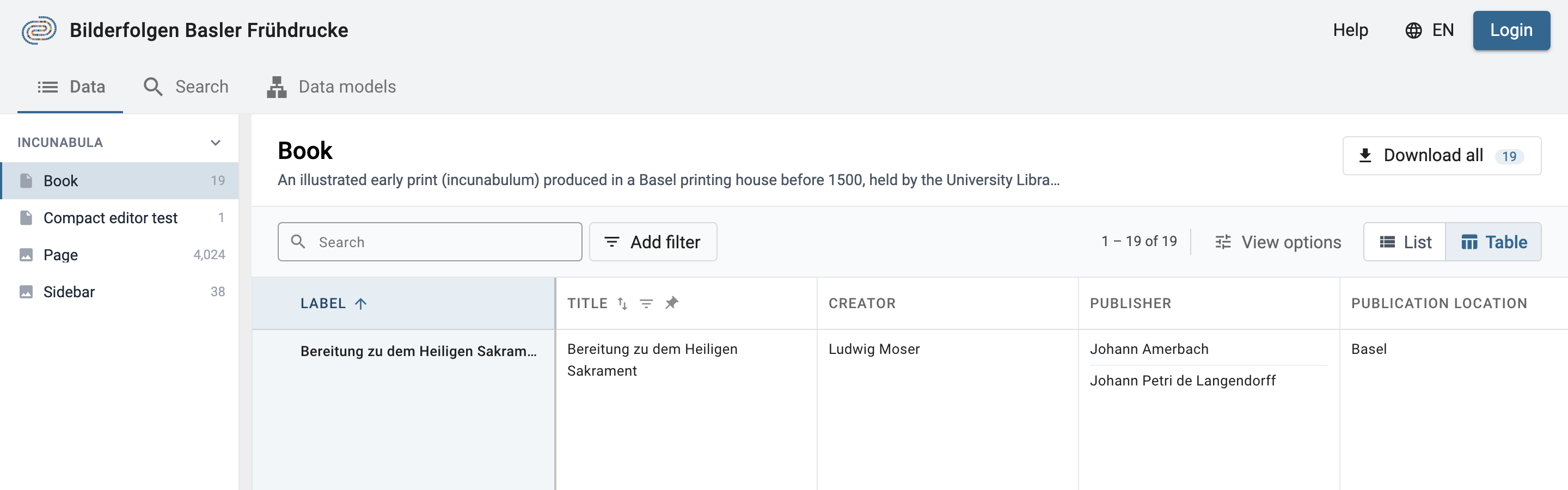
Hover over a column header to sort, filter, or pin it.
When columns are scrolled out of view under the label column, a small badge (e.g. ‹ 2) appears in the label header. Click it to scroll back to the first column.
Arrange Columns and Rows
- Reorder a column by dragging its header to another place.
- Resize a column by dragging its right edge. Double-click the edge to fit the column to its content.
- Resize a single row by dragging the bottom edge of its label cell. Double-click to reset it.
Click View options to choose which columns are shown and how tall the rows are:
- Row height — Auto fits each row to its content. Manual sets one height for all rows with a slider; longer content scrolls inside the cell.
- Columns — tick or untick a column to show or hide it, or use Hide all / Show all. The label column is always shown.
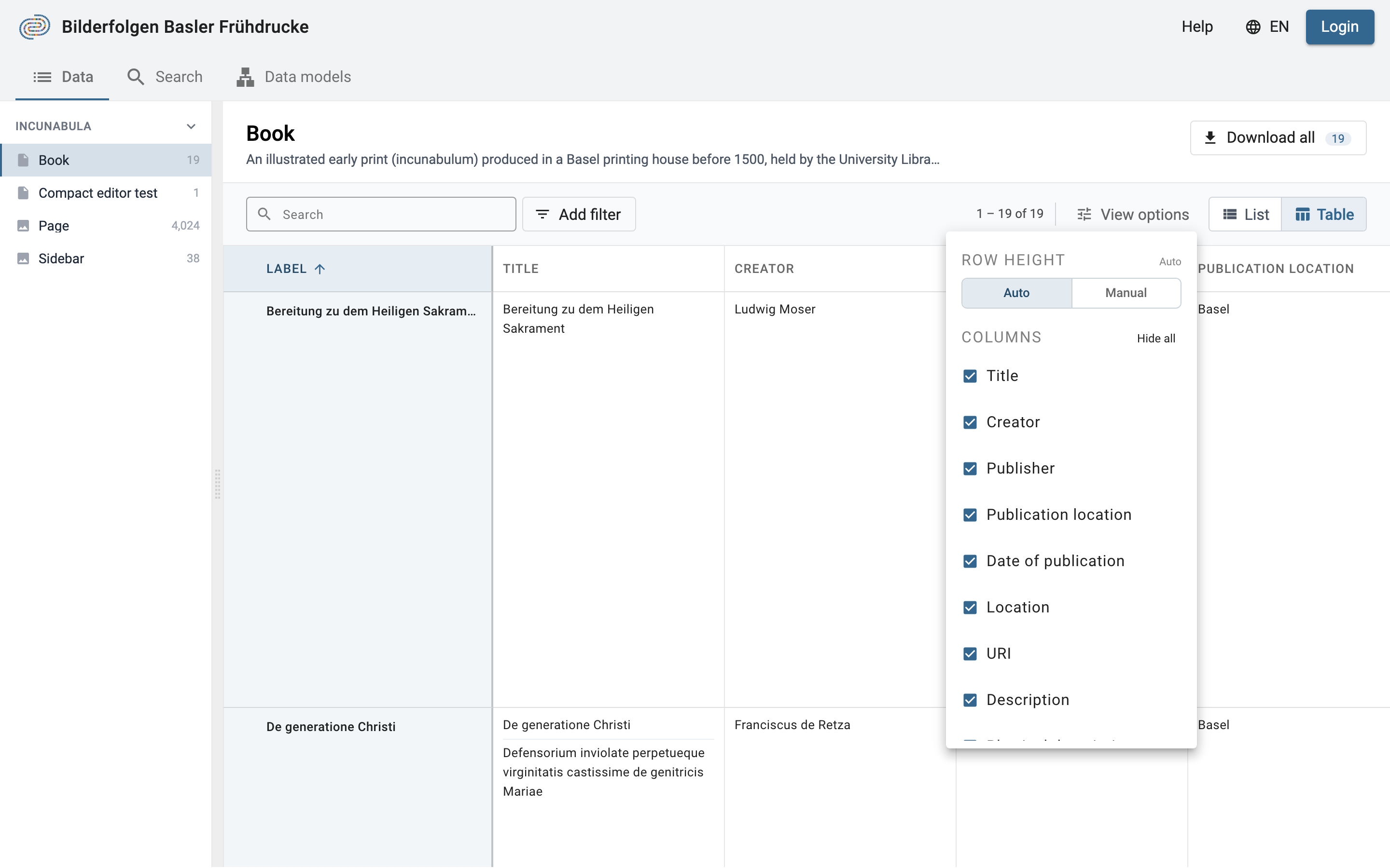
Choose the row height and the visible columns in View options.
Edit Values in the Table
If you are a project member with the required permissions, you can edit data directly in the table: hover over a value to edit or delete it, use Add value to add one, or drag values to reorder them — just as in the resource viewer (see Edit Your Data). To edit a resource label, hover over it and click the pencil icon.
A lock icon in a column header means that the column cannot be edited in the table — e.g. file values, or the license and copyright holder, which are set for the whole project in the project settings. Open the resource to see how such a value is set.
After you edit a value, the row stays where it is, even if it no longer matches the current sorting or filters. The table is updated the next time you search, filter, sort, or change page.
Open a Resource
Hover over a row and click the arrow icon next to the label to open the resource. It opens in a panel on the right side of the page; close the panel to return to the table.
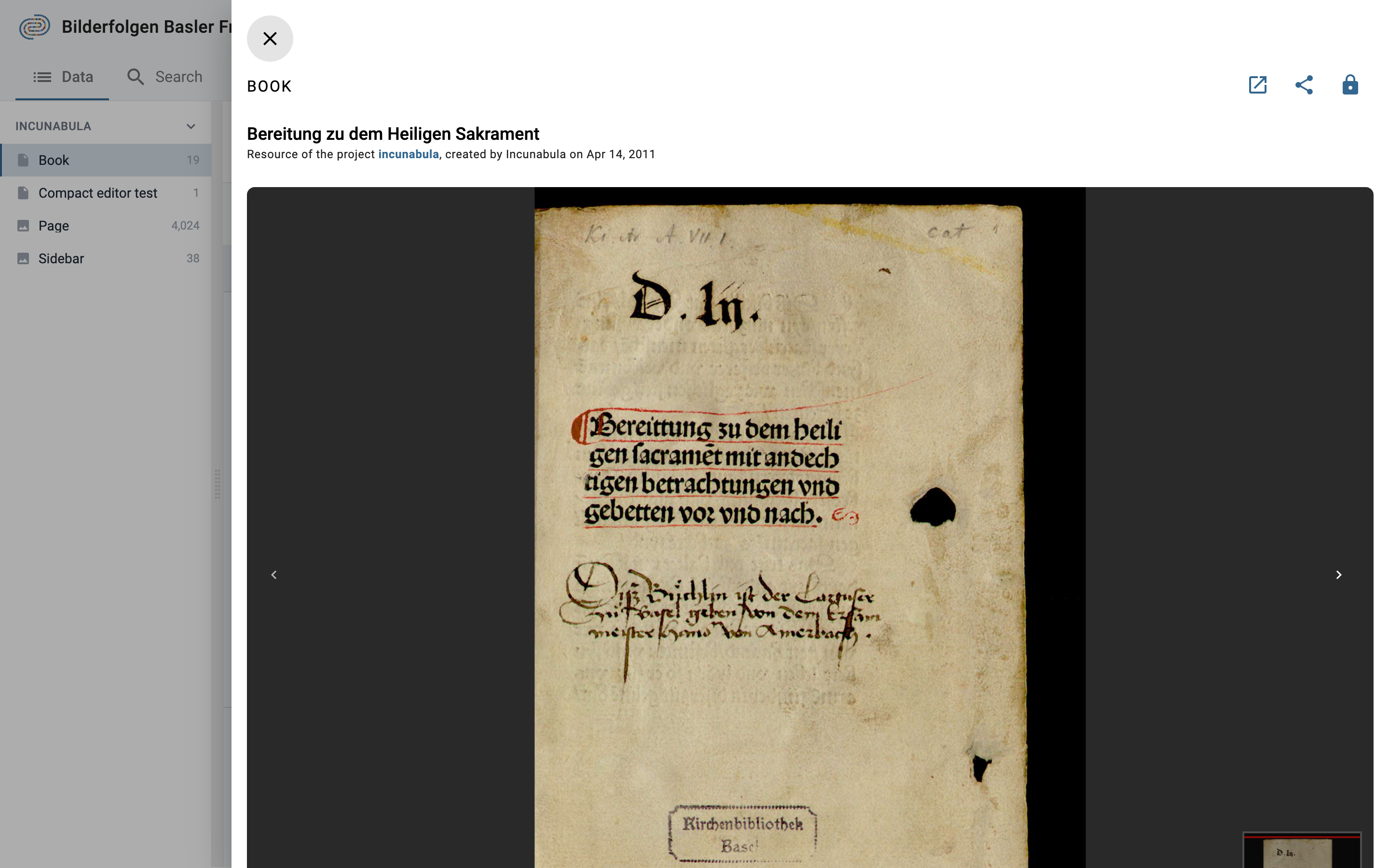
A resource opened from the table, in a panel on the right.
Data Permissions
In order to know what you are allowed to see or do with the selected resource, please check the permissions that are granted for your user role. You can find more details about the permissions in the documentation of DSP-API.
If you don't have the permissions you were supposed to get, please contact the DaSCH team.

Check the resource permissions you are granted.
Display Data
Display a Resource
DSP-APP offers different resource views for different media types (images, videos, audio, archives, text, and document files). You can open a resource from the Data tab or from the list of search results. Depending on the media type, DSP-APP offers different tools to work on the resource.
Additionally, you can work on the resource directly, e.g, mark regions of interest on images and documents.
Each media viewer offers different tools and functionalities, either displayed in the bottom toolbar (e.g. zoom, open in fullscreen button, play button, etc. - captioned in orange thereafter) or in the menu - the three-dot button on the bottom-left side (e.g. copy the ARK URL to the clipboard, download/replace the file, open the file in a new tab - captioned in red thereafter).

Single resource view. The resource type in this example is "Book Cover" and the image viewer displays the cover image.
Everything about the resource is displayed on the page. All the information about the resource itself (e.g. type, label, permissions, creator, date of creation, etc.) are displayed at the top of the page, the data (properties and values), and different functionalities such as editing, deleting, sharing the resource are in the "Properties" section - below the media player when it exists. You can find more information about the functionalities in the following sections.

Audio file
Supported file types: mp3, wav

Image file
Supported file types: jp2, jpeg, jpg, png, svg, tif, tiff
A resource of type "still image" is typically used for book pages, photographs, postcards, letters, diagrams, and similar visual content.
Upload options:
- Raster images (JP2, JPEG, JPG, PNG, TIF, TIFF): Upload from your local computer or via an external IIIF URL.
- SVG vector graphics: Upload from your local computer.
Region annotations: You can draw regions only on raster images uploaded from your local computer and annotate them. Region annotations are not available for external IIIF images or SVG files.
Vector graphic files: For vector graphics the viewer offers the feature to change the background color in order to better view SVG content. A user can choose between default, white, or transparent (checkerboard pattern) backgrounds using the palette icon in the toolbar.

For users without permission to see a restricted image, a notification will warn them at the top of the image viewer.

To access the regions, go to the annotation panel. You can click on an existing region in the image viewer, the focus of the page will be redirected to the annotation information.

Access the annotation panel from the resource toolbar.
Document file
Supported file types: pdf, doc, docx, xls, xlsx, ppt, pptx

Text file
Supported file types: csv, txt, xml, xsd, xsl

Video file
Supported file types: mp4

Archive file
Supported file types: 7z, gz, gzip, tar, tgz, z, zip

Display Resource Properties
By default, only important properties are shown in the resource viewer. To display them all, click on the button "Show all properties" in the resource toolbar.

Show or hide properties from the toolbar.
To get more information about the property value, i.e. date of creation and author name, hover over the value and then over the info button.

Get the creation date and the author name of the value.
Display Value Comments
To display the existing value comments, click on the button "Show all comments" in the property toolbar.

Show all property comments or hide them.
The standoff link and incoming link rows are only shown when the resource actually has such links.
Display Dates and Calendars
A date is always displayed in the calendar it was entered in. Next to it, a small marker shows the name of that calendar — Gregorian, Julian, or Islamic (tabular).
Click the marker to see the same date in all three calendars at once, with the stored calendar highlighted. The panel also shows:
- the JDN (Julian Day Number) of the date, or the range of days for a period;
- the ISO 8601 · EDTF form of the date, in the proleptic Gregorian calendar;
- for a period, its length in days.
Use the copy buttons to copy the JDN or the ISO date to the clipboard.
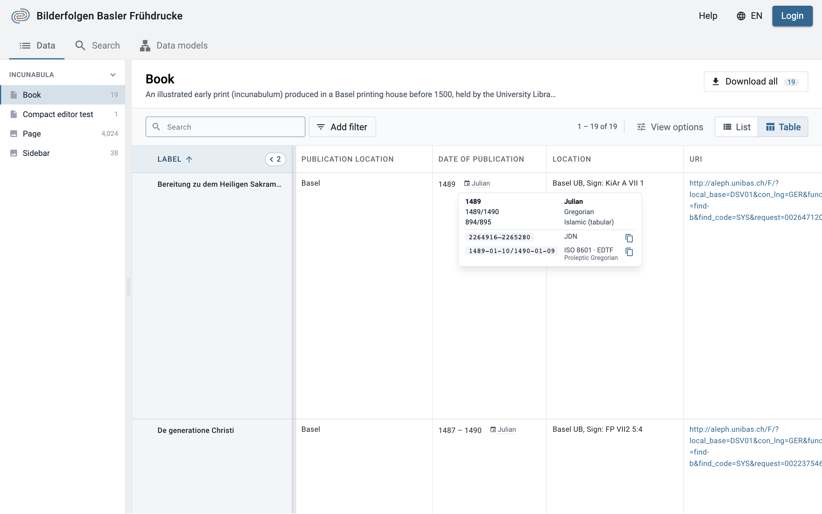
Click the calendar marker to see the date in each calendar.
When a year or a month does not match exactly in another calendar, it is shown as a span (e.g. 1489/1490). A date that falls in the ten days skipped by the Gregorian reform in October 1582 comes with a short explanation.
Display and Compare Several Resources
You can compare up to 6 resources of any type side by side. In the Data tab, select your resources of interest by ticking the checkbox that appears when you hover over a resource in the list. The selected resources are displayed next to each other in the resource viewer, and a bar above the list shows how many resources are selected. Click the ✕ on that bar to clear the selection.
You can also compare resources from the search results in the same way.
In the table view, the checkbox appears next to the label when you hover over a row. The comparison itself is shown in the list view: your selection is kept when you switch from Table to List.

Example: Select 3 resources and compare them.
To keep in mind: The more you compare, the smaller the resource viewer for each will be. You can deselect one or more resources, or click the ✕ on a resource, to remove them from the compare viewer.

Visualise your selected resources side-by-side. You can compare 2 images with an object without representation for instance.
Add New Data
Warning: You must have the granted permission to proceed.
Add a Resource
See section Create new resource instances.
Add a Property Value
You can create a new property value if your data model allows it. The value should have a cardinality of 0-1, 0-N or, 1-N.
A "plus" button is displayed to the right of the label or after the first value field. You fill in the form field and save the changes by clicking on the floppy disk button. You can undo (back arrow button) or cancel the changes (x button).

Add a new property value.

Save or undo the changes you made.
If your property is linked to another resource, you can search for an existing value by typing the first three letters of the resource label you are looking for. You can also create a new resource instance by clicking on the first option in the drop-down menu, Create new: xxx.

Add an Annotation
Depending on the type of resource, an annotation can be created by drawing a region on the images or by selecting a segment for audio and video resources.
Image annotation
To create a new region on an image, you click on the icon Create Annotation in the toolbar, then draw the desired square region you want on the image.

Select a region on the image with the drawing tool.
Enter the information about the region and an informative label. You may also add a description as a comment (optional). You can change the color.

Fill in the form about the selected region.
The new region information is displayed after the image viewer. You can edit or delete it if you have the granted permissions. A region has also an AKR URL you can copy and share.

A new region has been created.
Video annotation
To create a video segment, you click on the icon Create Annotation in the video player toolbar.

Create a new video segment.
Fill in the form Create Annotation by indicating at least the required fields: label, start (time), end (time), and submit to create your new video segment.

Form to create a video segment.
New segments are displayed within the Annotations tab, where you can view all the details for each segment.
Below the video scrubber in the player toolbar, all segments are also shown and are clickable, allowing you to jump to and play each segment. The corresponding data for each segment will be highlighted below the video player by clicking on the down arrow button.

Video segments display in DSP-APP.
You can edit or delete a segment or a property of a segment if you have the granted permissions. A segment has also an AKR URL you can copy and share.
Audio annotation
To create an audio segment, you click on the icon Create Annotation in the audio player toolbar.

Create a new audio segment.
Fill in the form Create Annotation by indicating at least the required fields: label, start (time), end (time), and submit to create your new audio segment.
New segments are displayed within the Annotations tab, where you can view all the details for each segment.
Below the audio scrubber in the player toolbar, all segments are also shown and are clickable, allowing you to jump to and play each segment. The corresponding data for each segment will be highlighted below the audio player by clicking on the down arrow button.

Audio segments display in DSP-APP.
You can edit or delete a segment or a property of a segment if you have the granted permissions. A segment has also an AKR URL you can copy and share.
Add a Footnote
Footnotes can be added to RichText content. Superscript numbers, which are clickable, will appear in the text, with the corresponding footnotes displayed below. When you hover over a superscript number, the footnote content will appear in a tooltip. If there are multiple text entries, all footnotes will be combined and ordered at the bottom of the last text entry.

To create a footnote, enter edit mode by clicking the pencil icon. Then, position your cursor at the end of the word or sentence where you want to add the footnote, and click the Footnote button in the toolbar. Enter your footnote text in the edit pad. To save, click the green checkmark at the bottom right corner of the footnote edit pad, then save again at the property value level by clicking the floppy disk icon.

Create a footnote.
Simple formatting and links can also be added to the footnote.

Add formatting and links to your footnote.
Edit Your Data
Warning: You must have the granted permission to proceed.
Edit a Resource
To edit the resource label, click on the pencil icon Edit label on the right-side of the resource label.

Edit a Property Value
You can edit a property value from the resource viewer. Hover over the value and click on the edit button.

Edit button when mousing over the value.
You edit your value by changing the text content, searching for another resource label, or creating a new resource instance. Don't forget to save your changes (floppy disk button) or undo them (back arrow button) to leave the edit mode.

It is the same process to add, edit or delete a comment to the value.
Edit an Annotation
For any type of annotation (image, video segment, audio segment), you can edit the annotation label and the property values.

Edit an annotation label, here it is an audio segment label.
Edit an Image File
To replace an image file, open the menu on the left side of the image viewer toolbar. Click on the Replace File button (if the image was uploaded from a local computer folder) or Replace External File URL (if the image was sourced from an external IIIF URL). Then, replace the file or URL and save your changes.

Edit a Date
When you edit a date, the current value is shown above the form as Stored value. The date form has:
- a calendar selector (Gregorian, Julian, Islamic) for the whole value;
- a date picker for the start date, and an end date if the value is a period. Use Add end date or Delete end date to switch between a single date and a period.
In the date picker, choose the year, the month, and the era (CE/BCE; AH for the Islamic calendar), then click a day. To enter a less precise date, use Month precision (no day) or Year precision instead of picking a day.
To convert a date to another calendar, choose that calendar in the selector. The date is converted and a note below the form tells you which stored value it was converted from. The Islamic calendar is not available for dates before the Hijra (1 AH).
Edit a Footnote
Footnotes can be edited in edit mode. Simply click the pencil icon, then click on the footnote link you wish to edit. Make your changes, and be sure to save them once you're done.

Reorder Property Values
When a property has multiple values (cardinality 0-N or 1-N), you can reorder them by dragging. A drag handle (⠿ icon) appears to the left of each value.
To reorder values:
- Hover over the value row to reveal the drag handle
- Click and hold the drag handle icon
- Drag the value to the desired position
- Release to drop. The new order is saved automatically

Drag handle (⠿) appears to the left of each value when the property has multiple values.

Drag a value to reorder it. A placeholder shows the target position.
Delete Your Data
Warning: You must have the granted permission to proceed.
Delete or Erase a Resource
To delete a resource, there are 2 possibilities:
- Delete resource: the resource is not searchable or findable in DSP-APP anymore but the data still exists in the database.
- Erase resource: the resource is permanently deleted from the database, it will be impossible to get it back.

Delete or erase a resource.
Delete a Property Value
You can delete a property value. Hover over the value and click on the delete button. You have to confirm your choice. It is possible to comment on the deletion of the value in the confirmation pop-up window to explain why it is being deleted.

Delete a property value.
Annotate and Link Data
The main feature of the flexible data storage that DSP-APP uses is the possibility to annotate and link resources and their metadata. An annotation can be a small note about a date like "Not sure about the birthdate of this person. There's another date mentioned in the resource XYZ". Inside the note, it will be possible to link to another resource.
Links in DSP-APP are always bi-directional. If you link resource A with resource B, then resource B knows about this connection. If you find resource B, you have the connection to resource A as well.
It is possible to link resources of the same project or from 2 different projects.
DSP-APP offers two ways to link data:
Internal linkage: it allows you to create a direct link between 2 resources. The label of the linking resource (source) will appear in the "incoming links" section of the targeted resource. You will choose this option when you want to embed the link in a text.
Link object: it allows you to create an annotation (the description of the link object) that can point to one or more resources. You will prefer this option if you want the link to exist and describe it.
Internal Linkage
To link 2 resources (A is an image and B is a document in the example), you go to your resource A that will be linked, click on the Share icon at the top of the page and click on the button Copy internal link on clipboard. You have copied the internal link of your resource A that will be used to make the link with your resource B.

Copy the internal link of the resource A.
Go to your resource B. You click on the edit button of the property value where you want to add the link (by hovering over the value content). This value must be of type rich text.

Edit the property value of type rich text to add the link.
You write and select a word or a group of words you want to attach the link to, then click on the Link button in the toolbar of the text editor, paste the internal link of resource A here, and click on Save.

Add the link in your text and save.
The word (or the group of words) is now highlighted in blue-grey and is clickable.

The link has been added to your text.
Link Object
To create a link object, go to the Data tab and select 2 or more resources of the same project, in the list or in the table view. Then click Create a link object on the bar that shows the number of selected resources. You need to be a member of the project.

Select the resources to link.
In the Create a collection of … resources form, enter a label in Collection labels to identify the link object. Optionally, you can add a Comment (annotation) to describe this collection of resources. The form lists the resources that will be connected. Then, click Submit. The link object is created in the project of the selected resources.

Fill in the form about the new link object.
The linked resources are listed in the has Link to property of the link object resource viewer. The label of your link object is searchable through a full-text search.

It is possible to add other resources later on by clicking on the + button in the has Link to property section.
Annotation Previews
An annotation preview displays an image annotation — a region drawn on a still image — as a standalone cropped image on another resource. It also links back to the source image and its legal information. This lets you use an annotation as visual evidence on the resource that describes it, without duplicating the image.
Before you start:
Your data model must include an Annotation preview property. See Annotation Preview Property for how to add one.
Copy an Annotation's Internal Link
To add an annotation preview, you first need the internal link of the annotation you want to display. Open the source image resource, go to the Annotations tab, and open the menu (three-dot button) of the annotation. Click Copy internal link to clipboard.

Copy an annotation's internal link from its menu.
If you still need to create the annotation, see Image annotation.
Add an Annotation Preview
Go to the resource where you want to display the annotation. Find the Annotation preview property (here labelled Location Preview), paste the copied internal link into its field, and save your changes with the floppy disk button.

Paste the internal link and save to create the annotation preview.
View an Annotation Preview
The annotation preview displays the annotation as a standalone cropped image, next to a small thumbnail of the full page. Below the image, a link takes you to the annotation, and a legal footer lists the copyright holder, authorship, and license which are derived from the source image — it is not entered on the annotation preview itself.

An annotation preview showing the cropped image, the annotation link, and the legal footer.
View the Annotation in Context
Click the link to open the full image with the annotation highlighted, so you can see it in the context of the whole page.

The annotation highlighted within its full source image.
You can edit an annotation preview to point to a different annotation, reorder annotation previews by dragging, or remove them — just like any other property value (see Edit a property value, Reorder property values, and Delete a Property Value).
Share Your Data
Each resource of your dataset gets an ARK URL (Archival Resource Key), a persistent identifier that will allow you to permanently cite your resource in papers, conference presentations, books, etc.
You will find it by clicking on the Share icon at the top of the page. Then, click on Copy ARK url to clipboard to copy and paste it wherever you want.

Copy ARK URL.
Download Data
DSP-APP allows you to export resource data as CSV files for further analysis or sharing outside the platform. The download feature works per resource class, exporting all resources of the selected class.
To download data, navigate to the Data tab, select the resource class you want to export from the left sidebar, and click the Download all button in the class header. The badge on the button shows how many resources will be exported.
A dialog appears showing the number of resources and the available properties. Use Select All or Select None to quickly toggle all properties, or select individual ones as needed.

Select which properties to include in your CSV export.
The CSV export includes all selected property values, including footnotes, hierarchical list nodes, and controlled vocabulary values. Selecting a resource class exports all resources of that class and its subclasses. When legal metadata is set, the license, copyright holder, and authorship are included in the export automatically.
The download form is fully usable on mobile devices and small screens.
Enable Include Resource IRIs for reference properties to export both human-readable values and unique Resource IRIs for linked resources. This is useful for data analysis or integration with other systems.
Enable Include ARK identifiers to add a persistent ARK URL column to the export. This is useful for citing resources in publications. The ARK URL column appears first in the CSV, before Resource IRI and Label.
Click Download … resources to export. The file contains one row per resource with columns for each selected property. Large exports can take several minutes: a progress bar shows how many resources have been exported, and the download starts as soon as the file is ready. Keep the tab open in the meantime.